THE NITTY GRITTY
Having operated the studio at different times on both coasts, The Local Brand Co. offers a forward mindset for every project. We use a West Coast optimism balanced with an East Coast analytical approach. Our process begins with dialogue, market analysis and discussions about your branding concerns. Next is the creative process of blending all the target elements together to form the visual language. Finally, production and implementation. With the new visual vernacular in place, your unique brand identity is complete, translating into increased media recognition and sales.

A pocketful of genius. Coolness in a box. A Mid-Century Modern education in 26 remarkably easy lessons. The studio’s Modernist Alphabet Flashcards were inspired by California’s MCM style. They were featured on design-centric sites Dwell, Design Within Reach and HGTV. The cards retailed at the Smithsonian Cooper-Hewitt Design Museum and the San Francisco Museum of Modern Art. The cards were originally created for my then 7yr old daughter to teach her about modernism.
Forget A is for Apple.
B is for Bauhaus is where it's at.
M is for Modern Alphabet Flashcards
Product Tagline
THE NITTY GRITTY
Having operated the studio at different times on both coasts, The Local Brand Co. offers a forward mindset for every project. We use a West Coast optimism balanced with an East Coast analytical approach. Our process begins with dialogue, market analysis and discussions about your branding concerns. Next is the creative process of blending all the target elements together to form the visual language. Finally, production and implementation. With the new visual vernacular in place, your unique brand identity is complete, translating into increased media recognition and sales.

A pocketful of genius. Coolness in a box. A Mid-Century Modern education in 26 remarkably easy lessons. The studio’s Modernist Alphabet Flashcards were inspired by California’s MCM style. They were featured on design-centric sites Dwell, Design Within Reach and HGTV. The cards retailed at the Smithsonian Cooper-Hewitt Design Museum and the San Francisco Museum of Modern Art. The cards were originally created for my then 7yr old daughter to teach her about modernism.
Forget A is for Apple.
B is for Bauhaus is where it's at.
M is for Modern Alphabet Flashcards
Product Tagline
THE NITTY GRITTY
Having operated the studio at different times on both coasts, The Local Brand Co. offers a forward mindset for every project. We use a West Coast optimism balanced with an East Coast analytical approach. Our process begins with dialogue, market analysis and discussions about your branding concerns. Next is the creative process of blending all the target elements together to form the visual language. Finally, production and implementation. With the new visual vernacular in place, your unique brand identity is complete, translating into increased media recognition and sales.

A pocketful of genius. Coolness in a box. A Mid-Century Modern education in 26 remarkably easy lessons. The studio’s Modernist Alphabet Flashcards were inspired by California’s MCM style. They were featured on design-centric sites Dwell, Design Within Reach and HGTV. The cards retailed at the Smithsonian Cooper-Hewitt Design Museum and the San Francisco Museum of Modern Art. The cards were originally created for my then 7yr old daughter to teach her about modernism.
Forget A is for Apple.
B is for Bauhaus is where it's at.
M is for Modern Alphabet Flashcards
Product Tagline
THE NITTY GRITTY
Having operated the studio at different times on both coasts, The Local Brand Co. offers a forward mindset for every project. We use a West Coast optimism balanced with an East Coast analytical approach. Our process begins with dialogue, market analysis and discussions about your branding concerns. Next is the creative process of blending all the target elements together to form the visual language. Finally, production and implementation. With the new visual vernacular in place, your unique brand identity is complete, translating into increased media recognition and sales.

A pocketful of genius. Coolness in a box. A Mid-Century Modern education in 26 remarkably easy lessons. The studio’s Modernist Alphabet Flashcards were inspired by California’s MCM style. They were featured on design-centric sites Dwell, Design Within Reach and HGTV. The cards retailed at the Smithsonian Cooper-Hewitt Design Museum and the San Francisco Museum of Modern Art. The cards were originally created for my then 7yr old daughter to teach her about modernism.
Forget A is for Apple.
B is for Bauhaus is where it's at.
M is for Modern Alphabet Flashcards
Product Tagline
DROP US A LINE TODAY


Aloha!
Here's a quick take of The Local Brand Co. Below is the backstory & thought process behind your neighborhood branding studio. Mahalo and enjoy


THE LOCAL BRAND CO.'S CONCEPTUAL IDENTITY IS BASED ON HAWAIIAN ETHOS

The Kona Brewing Co. sticker drawings were reinterpreted classic surf silhouettes focused on the local Hawaiian surf culture. The promotional image was featured in various social media posts.

KBC "THE SLAB" CIRCLE STICKER
Whether maxed out or a bomb, Waimea Bay is the hallowed ground of big wave surf spots. Few have surfed it better than Eddie Aikau. This sticker is an ode to Waimea Bay, those who love big wave surfing and the lifeguards who protect them. Lastly, to The Eddie that continues to be the premiere event in surfing.

KBC "DAWN PATROL" RECTANGLE STICKER
Dawn Patrol at Pipeline in your 1971 VW Bus with that favorite stick strapped up top, watching the steady diet of chunky lefts roll in. This sticker is a homage to the daily mantra of Surf is Life and those chosen few who get barreled before hitting that 9-5.
Fun fact: The KBC Big Wave stickers went into all the tote bags for the 2023 Eddie Aikau Big Wave Invitational invitees. The contest took place at Waimea Bay on the North Shore of Oahu. (Upper) The "ODKF Heritage Identity" graphic assets were part of a larger holiday promotion and legacy branding for The Outrigger Duke Kahanamoku Foundation.

Greg Chinn
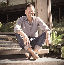
Owner | Creative Director
The Local Brand Co.
Your neighborhood branding studio crafting engaging stories with an ESG (Environmental, Social and Governance) mindset. Happily producing upbeat visual language with an eclectic style of modernism.
The Local Brand Co. Guiding Philosophy
ESG stands for Environmental, Social and Governance. The term refers to the three key factors when measuring sustainability and ethical impact of a business.


(Upper) The Anako line of health and wellness products are hand made with utmost care in small batches. They can be purchased online and at various retail/farmer's market locations in-and-around the Greater Los Angeles area. (Lower) Brand identity for a local Carmel-based health and wellness company.

LOCALLY INSPIRED + REGIONALLY CRAFTED
Greg takes inspiration from all the various places he's lived or visited. Like a local chef who sources seasonal ingredients and creates regional dishes, Greg mixes all the inherent cultural styles/iconography together and crafts unique visual vernacular. He is constantly exploring his neighborhood and the surrounding communities. The conceptual confluence of Hawaii and East/West Coast ideologies continue to inform his work along with guiding the aesthetic sensibility of The Local Brand Co.
Q&A with Greg in Voyage LA: Local Stories section in an article titled, Life & Work with Greg Chinn. Voyage LA's mission is to build a platform that fosters collaboration and support for small businesses, independent artists and entrepreneurs, local institutions and those that make Los Angeles interesting.
"
Design is thinking made visual.
"
American Graphic Designer | Oscar-Winning Filmaker
Saul Bass


THE RESULT


Wherever Greg has lived, collaborating with neighborhood businesses has always been the cornerstone of his work. Whether on the East/West Coast or Hawaii, these local businesses are the key to how a community functions. Equally important is how the business is perceived and the impression it exudes. Greg has been lucky to have worked with forward-thinking clients who are looking for something visually fresh with a strategic backbone. Below are some case studies that will give you an idea of the eclectic brand of modernism and conceptuaI rigor he applies to each project.
(Upper) 4 images of "Duke: An Iconic Life 8-Part Timeline initiative" posted on the ODKF Instagram/Facebook sites and (Lower) New Holiday Promotion merchandise. (Left) The Outrigger Duke Kahanamoku Foundation article titled, Greg Chinn Brings His Eclectic Brand Of Modernism to ODKF's New Holiday Promotion. He briefly touches on his influences and channeling the "California Cool" aesthetic.


"
It's an ideal symbiosis when nonprofits can partner with artists. The Foundation is so fortunate that Greg Chinn - such a high-caliber graphic artist - has chosen to bring new light to Duke's legacy and help us reach more local kids.
"
Sarah Fairchild
Executive Director | Outrigger Duke Kahanamoku Foundation
THE WORK


The Local Brand Co’s visual aesthetic has a vintage California Cool vibe, channeling West Coast Modernism. Inspired by surfing, a relaxed Swiss Style, handcrafted looks, eclecticism, Chet Baker/The Beach Boys/Joni Mitchell, the Case Study House program and Greg's neighborhood of Laurel Canyon…the company was born. Greg has always been drawn to telling a visual story. As he's gained experience, Greg has become adept at telling his personal story as well as that of clients – each tale unique to their companies.
(Above) Museum identity graphics for The Amistad Center for Art & Cutlure. (Left thumbnail) ShoutOut LA / Local Stories section article titled: Meet Greg Chinn | Laurel Canyon Design Dad . It's a Q&A with Greg about what matters most to him, his work/career and a local hot spot. (Lower) Exhibit identity for Finding Freemans: Wisdom For Contemporary Cornwall From Its 19th Century Black + Indigenous Neighbors sponsored by The Cornwall Museum/CT Humanities. (Bottom) Exhibit graphics for The Harp Historical Museum & Hartford Capital Community College.
Tip the world over on its side and everything loose will land in Los Angeles.
"
"
Frank Lloyd Wright
Legendary Architect


SELECT CASE STUDIES

